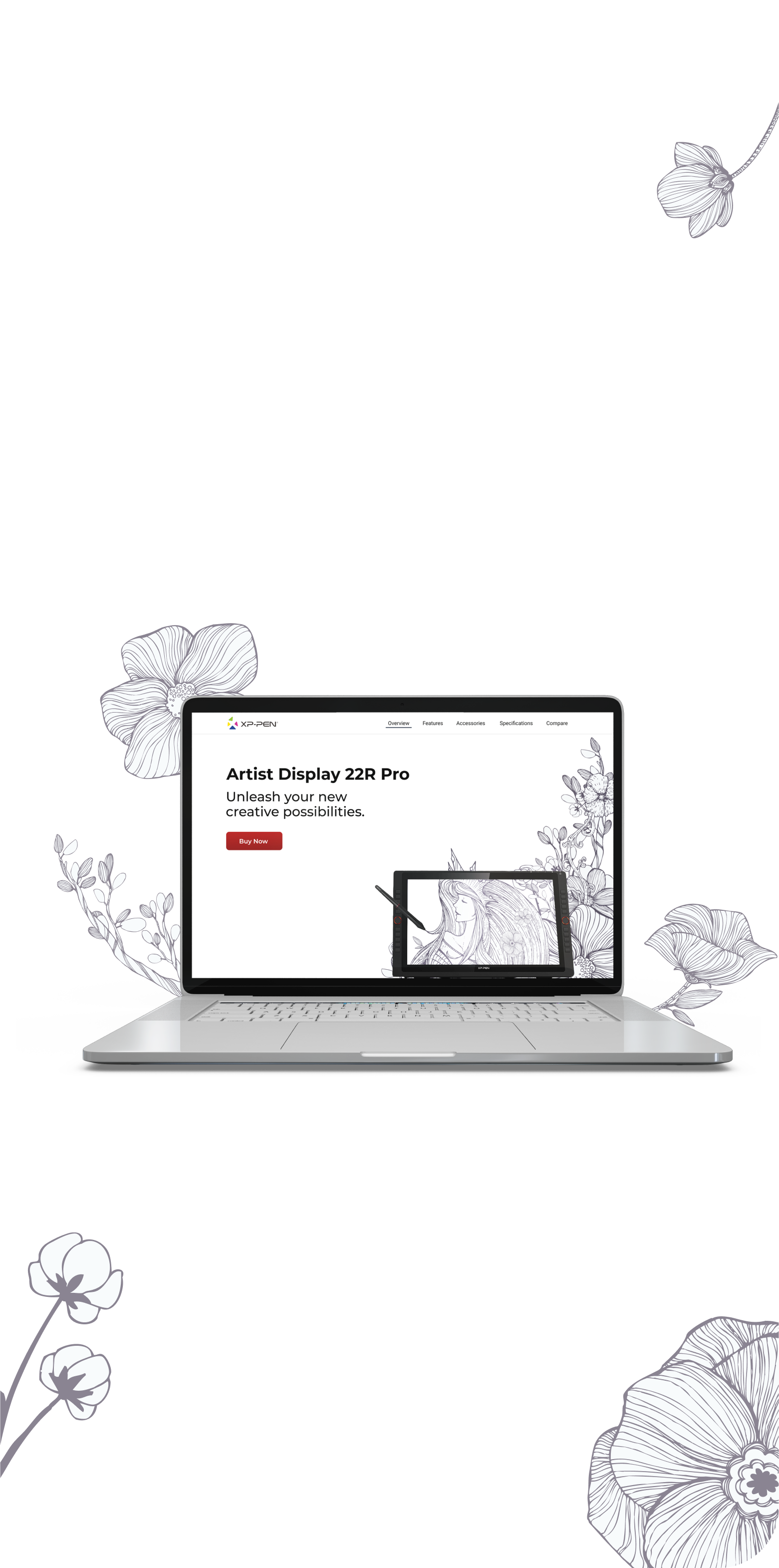


On the original product page, there is a lot of information shown in text lists
without any visualization or images.
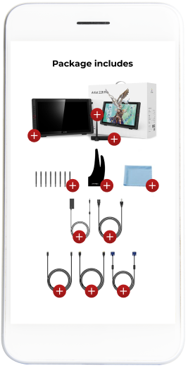
There is no hierarchy in the specifications and no images in "Package Includes".
In addition, accessories are not detailed anywhere on the page
and a comparison tool doesn't exist.
All of these make it difficult to scan the information
and require reading the entire list to find relevant information.
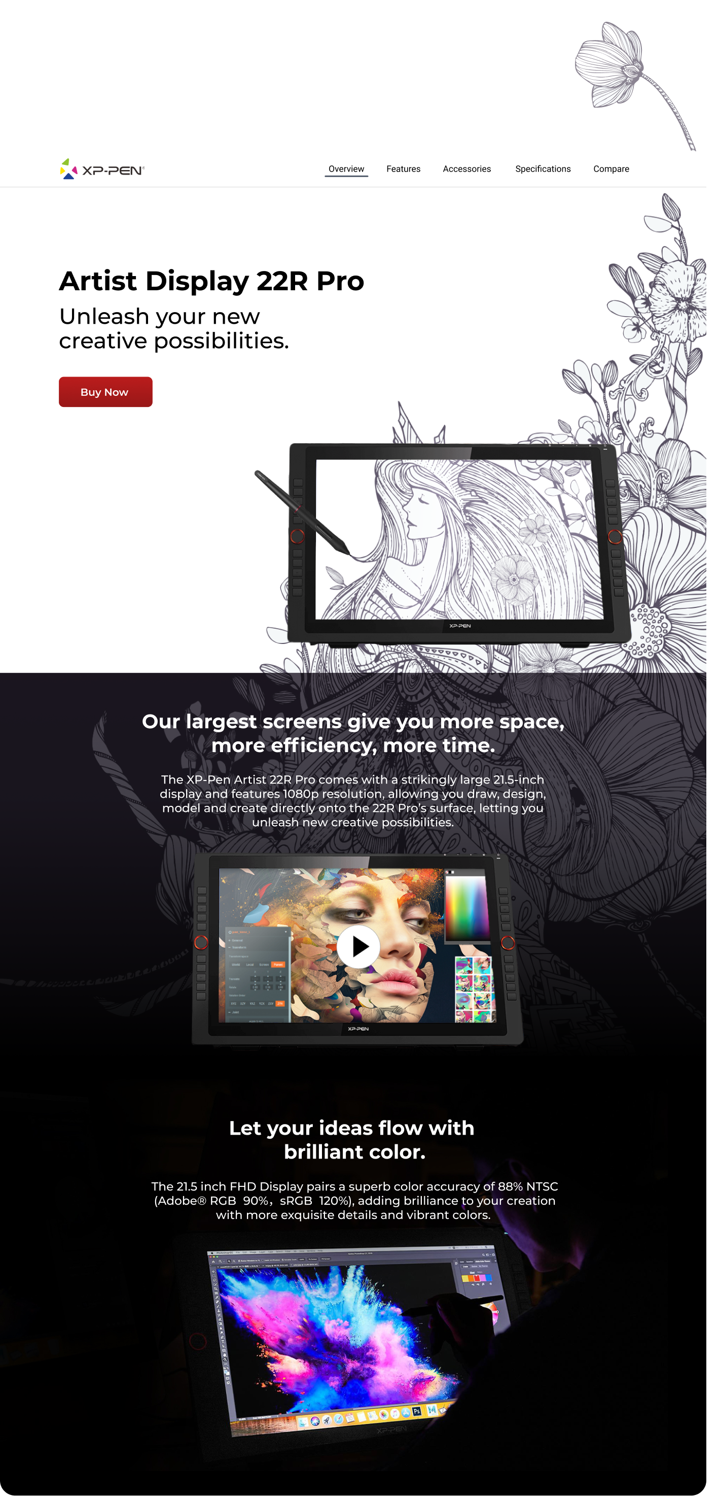

Yarden, 32 Years Old.
Graphic designer specializing in illustration.
Yarden uses a graphic tablet for illustrations.
When she is looking for a new graphic tablet, it is important for her to know its size and level of accuracy.
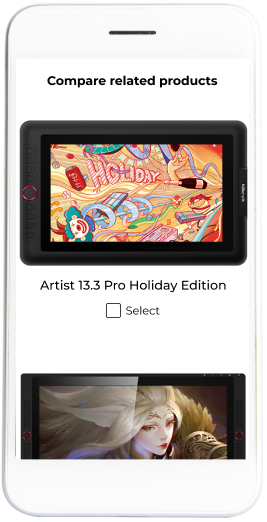
She often uses a comparison tool to check products that interested her.

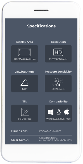
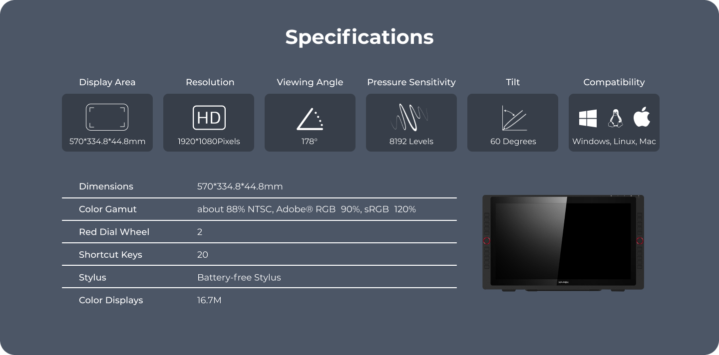
Displaying a hierarchical specification with illustrations
for a quick overview of the information.
The important information appears at the top with illustrations,
the rest of the information appears as a list for additional details.
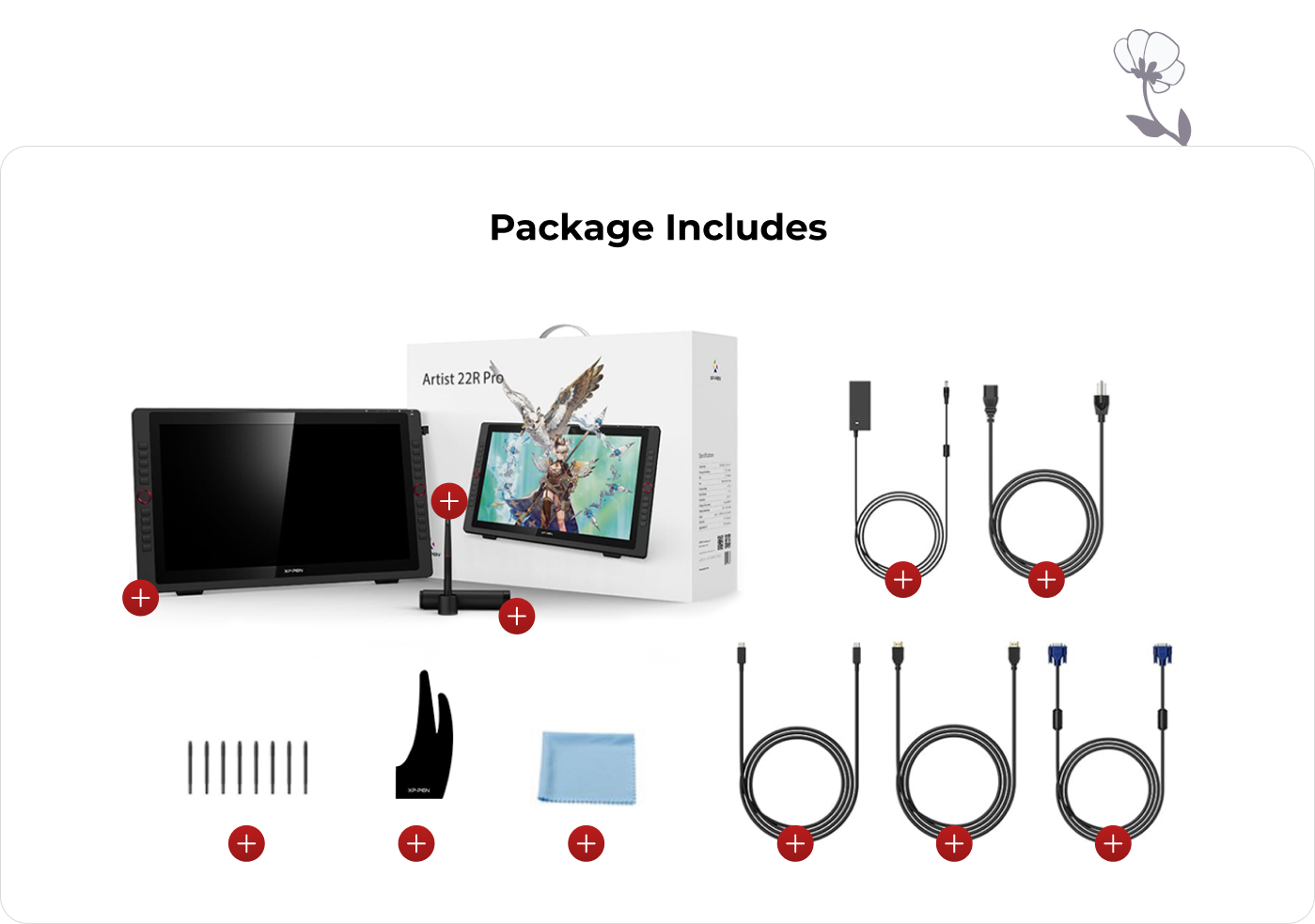
Displaying "Package Includes" images with tooltips.
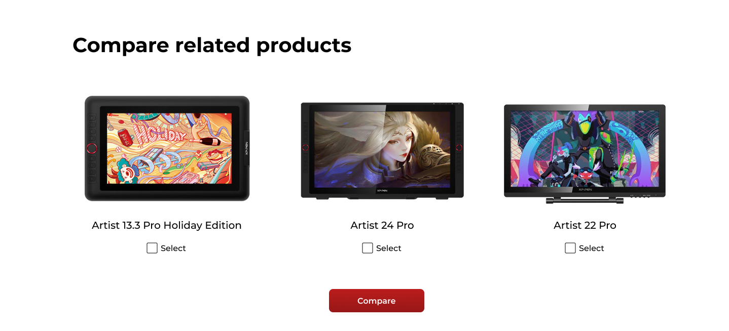
Adding a time-saving product comparison tool.
Displaying relevant accessories for easier and faster shopping.

